


I Painted My House a Color Called "Goodnight Moon."
Here's how I'm feeling about it one year later.

Photography by Sara Tramp
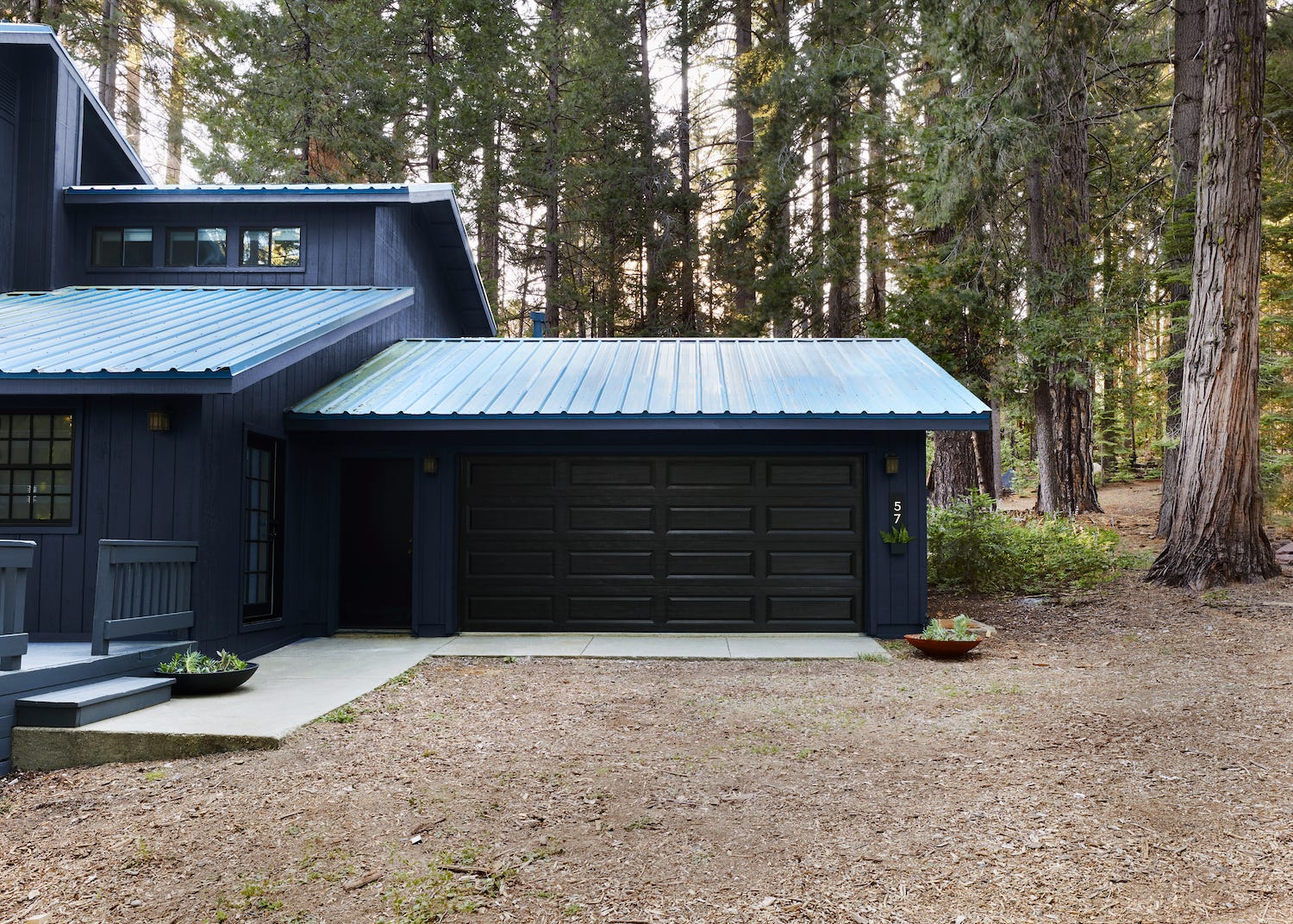
One of the frustrations I have with Londo Lodge, my Yosemite-area cabin, is that in my head I’ve already completed a massive million dollar overhaul. When I bought the house in 2020, I added up everything that I wanted to do to it and I guessed I’d spend about $500,000 over time making it into what I wanted. And what I wanted was a house that is pretty similar shape and layout wise to its current form with a few key additions: a living room big enough for a house this size (I currently use a small dining space as the living room), a garage that’s NOT facing the wrong way for snow (the current garage is designed the exact wrong way for snow and gets blocked in by ten feet of snow regularly because of the roofline), and an interior/exterior style that feels more 1929 Craftsman, less 1993 Builder Box.
I definitely had a vision for this place the second I saw it. But I’m realizing over time that 1. This is not a $500,000 project (by the time I get to everything it might not even be just a million dollar project). 2. This project is going to take me a very long time, which is fine because honestly WHAT ELSE DO I HAVE GOING ON?
I’ve done most of the updating to this house myself, including but not limited to:
Removing the original owners’ furniture, including a bedbug-infested bed and three gigantic tube televisions that must have weighed 300 pounds each.
Removing 3000 sq/ft of carpet.
Changing almost all of the light fixtures.
Painting every single interior space.
Updating the home’s four bathrooms by removing mirrors, ugly slider shower/bath enclosures, and adding decor.
…And so on. The only major projects I have gotten any help with are the floors (which I changed to beautiful Riva floors), the kitchen (which I have had sourced and designed for three years), and painting the home’s exterior. The floors and the kitchen took FOREVER. With the flooring, I had to find the right time to install them when the house could be a mess for weeks on end so I ended up storing the wood flooring for six months before I could find someone to install it (and before that I’d had to wait for it to be delivered, I think around nine months because this was in the height of pandemic delays). I think this is all top of mind because I’m on year three of my kitchen renovation and it’s been fully demo’d/unusable since January.
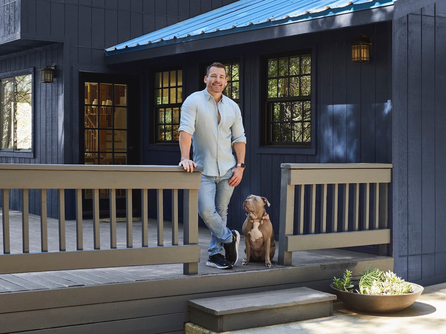
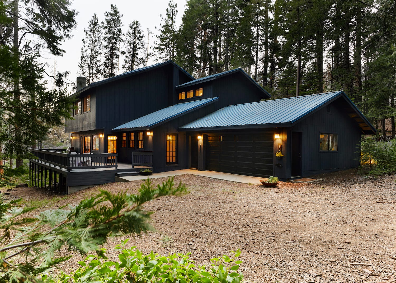
All of this is to say that since I got my house I’ve basically had two choices when it comes to renovation projects: 1. Do it myself or 2. Know that it’s going to take a frustratingly long time because I can’t really afford higher end, at-the-ready labor. The one project that has deviated from this is painting the exterior of the house, which happened so quickly a year ago that I haven’t really had time to chat about it. It truly was the easiest, potentially most effective, transformation this house has seen.

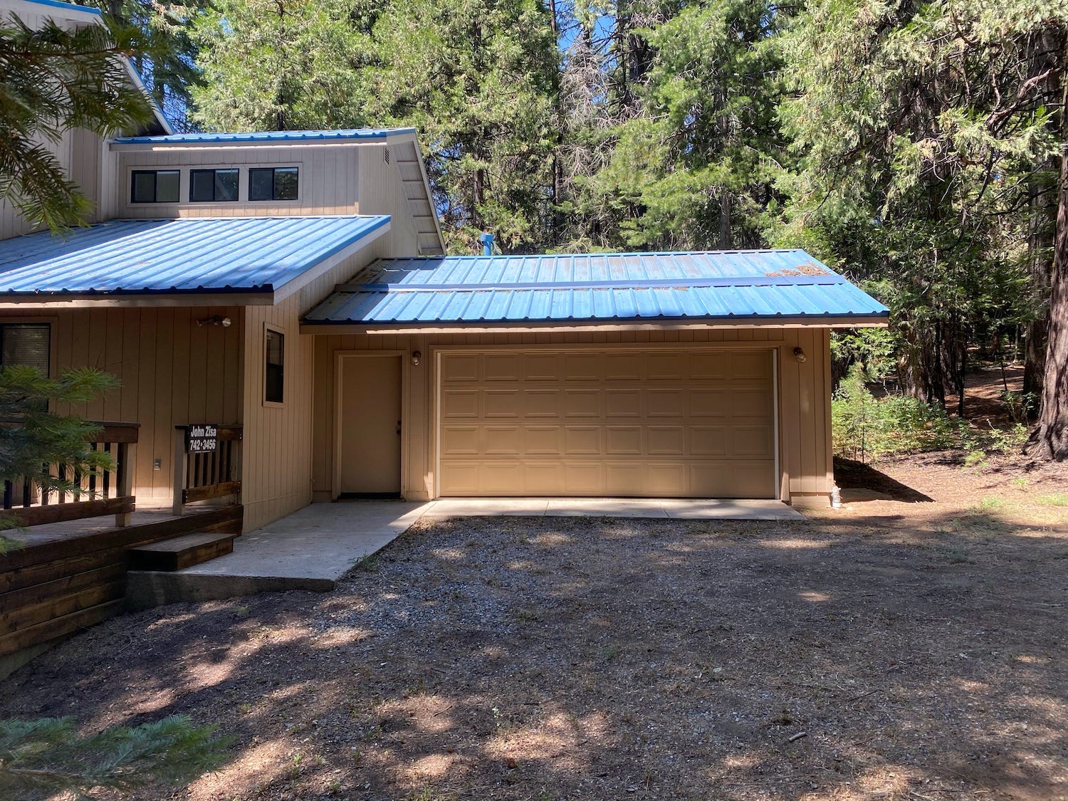
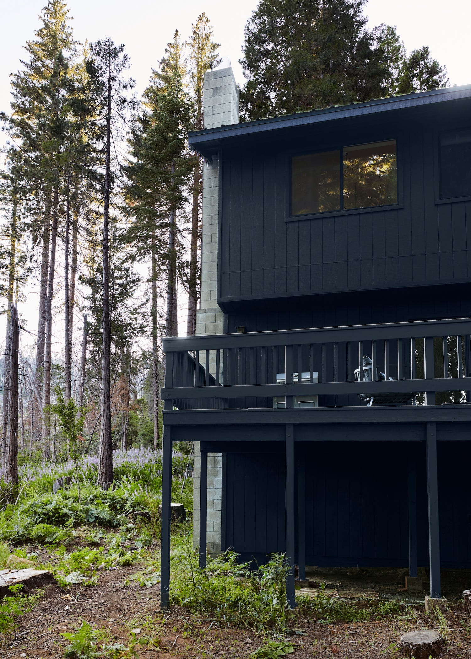
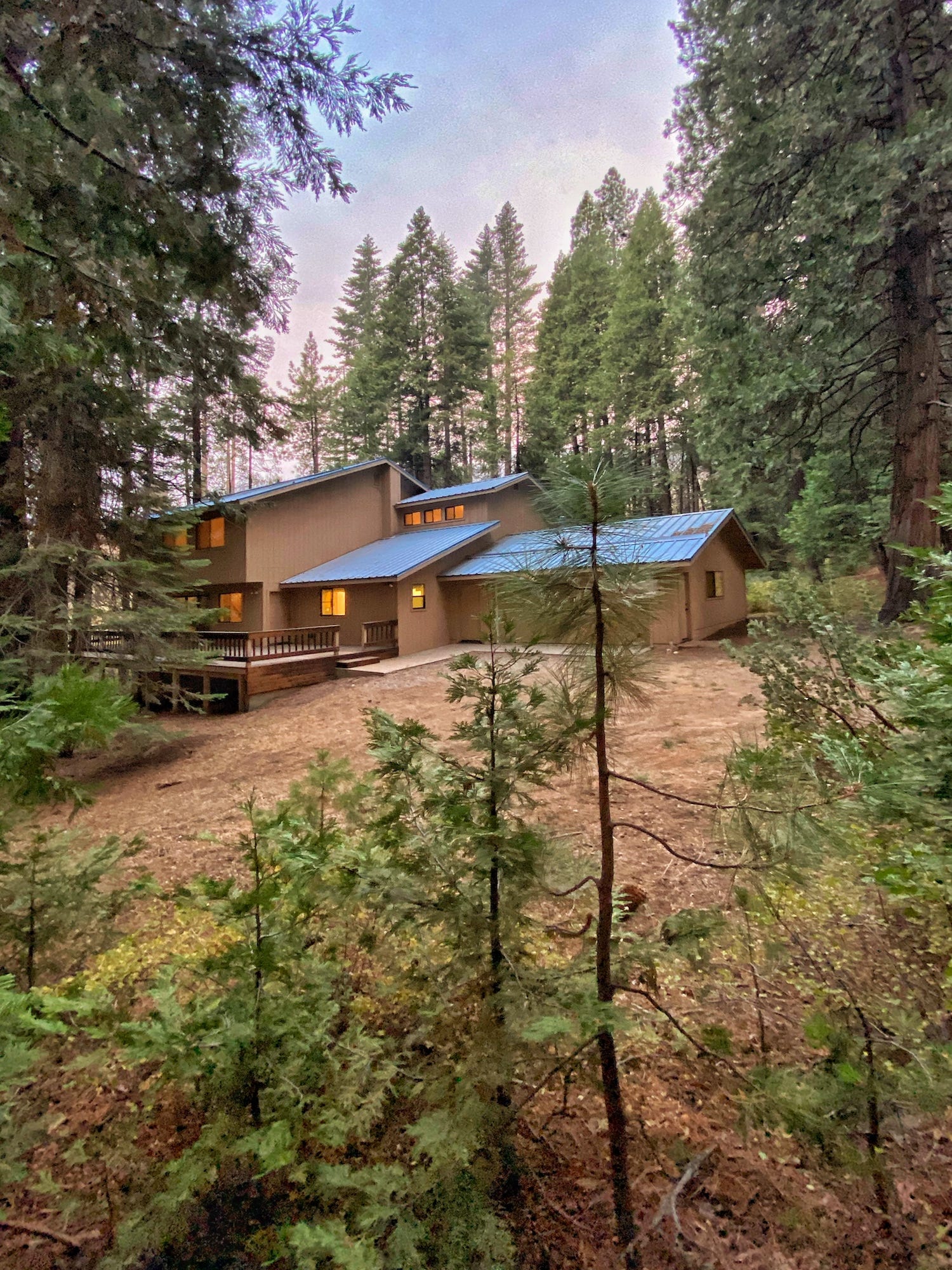
When I moved in the house was painted the original color, beige. I’m pretty sure the paint job inside and out was the original one. The family that owned this home didn’t use it very often so everything inside was pristine, if dated. The exterior was the same. It definitely wasn’t offensive, but the house lacked any sort of sophistication.
My least favorite thing about the home’s exterior is the roof color. I guess I like it conceptually, like I’ve seen art and design use this color and I’ve loved it (it’s been one of my friend Ben’s go-to colors for years). But in practicality it’s extremely hard to work with. Like not a lot of colors go with it. It does something that can either go really right or really wrong when it comes to design - it BEGS for attention. It’s a needy color, just screaming “PLEASE LOVE ME WHY AREN’T YOU LOOKING AT MEEEE!?!” If you’re charmed by it, you’ll be like “Oh pretty, what a cool color!” If you’re not into it, your response is more like “Ugh that bitch again!?! WHAT DOES SHE WANT THIS TIME!?!”
The house is in many ways a time capsule of mid-range 80s conventionality. It was built in the early nineties, which was basically when eighties design really reached its height. I think at the time the roof color probably felt fresh. But by the time I moved in it just felt a bit too try-hard/look at me/mommy didn’t love me.
I knew the roof color was going to be a bit of an encumbrance design wise. But often having a parameter is really helpful for making further decisions so I didn’t really mind that limitation. Oddly, as I went through colors that would go well with the bright roof, I kept coming back to beige. However, the only reason I was even thinking about painting is that Clare, a frequent sponsor and collaborator I’ve been working with for years, came through with an offer to paint the home (and pay for labor!). When you do sponsored projects like this, the brand wants you to choose the type of paint you want in the color you want, especially if its a color they don’t have images of yet. However, as a content creator I also wanted a visible change in the before and after. I wanted to give some good takeaways on how you can truly change the full vibe of a house just with paint. So I knew beige was off the table (though I did STRONGLY consider one of my favorite Clare beige tones, No Filter).
With beige off the table, I knew I was pretty limited in terms of options. I could go white, but that would end up looking a little 80s Country Kitchen (that shade of blue combined with white goes country really fast). I could go black, but I have a thing about that whole “paint the cabin black” trend (more on that in a minute). Or I could go blue, but my worry there was that my house would look like a Smurf.
This gets me to something I’ve been thinking about a lot the past few years. I’ll often get pushback from clients that something I source for them looks like something else. For example, I recently showed these chairs to a client and they said “Hey! Those look like ants!” And I was like, “yeah, they do.” But then later in the day I was like “WHAT’S WRONG WITH ANTS?”
So as much as I was worried my house would look like Papa Smurf, I also was like WHAT’S WRONG WITH PAPA SMURF? Design is so much about associations that we make with certain objects. But sometimes I think we get so tied up in a “That looks like _____” conversation that it keeps us from being able to see forms, colors, textures, finishes, etc as they are. It limits creativity. How can my Smurf association with blue go away if I don’t try using blue in new ways? That’s why I decided to go with Goodnight Moon for my home’s exterior.
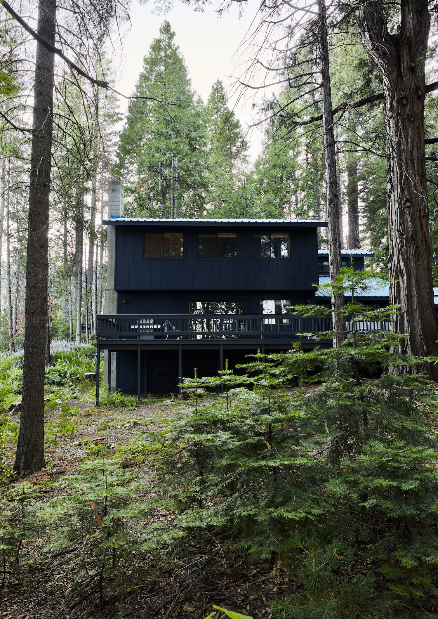
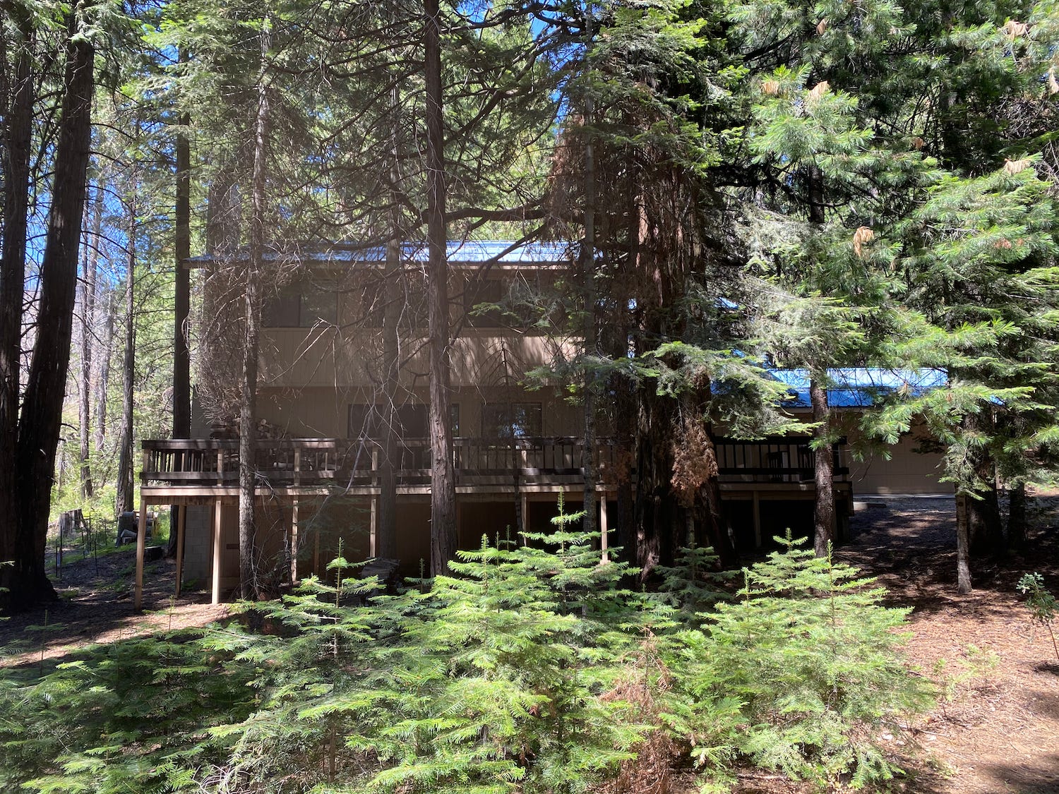
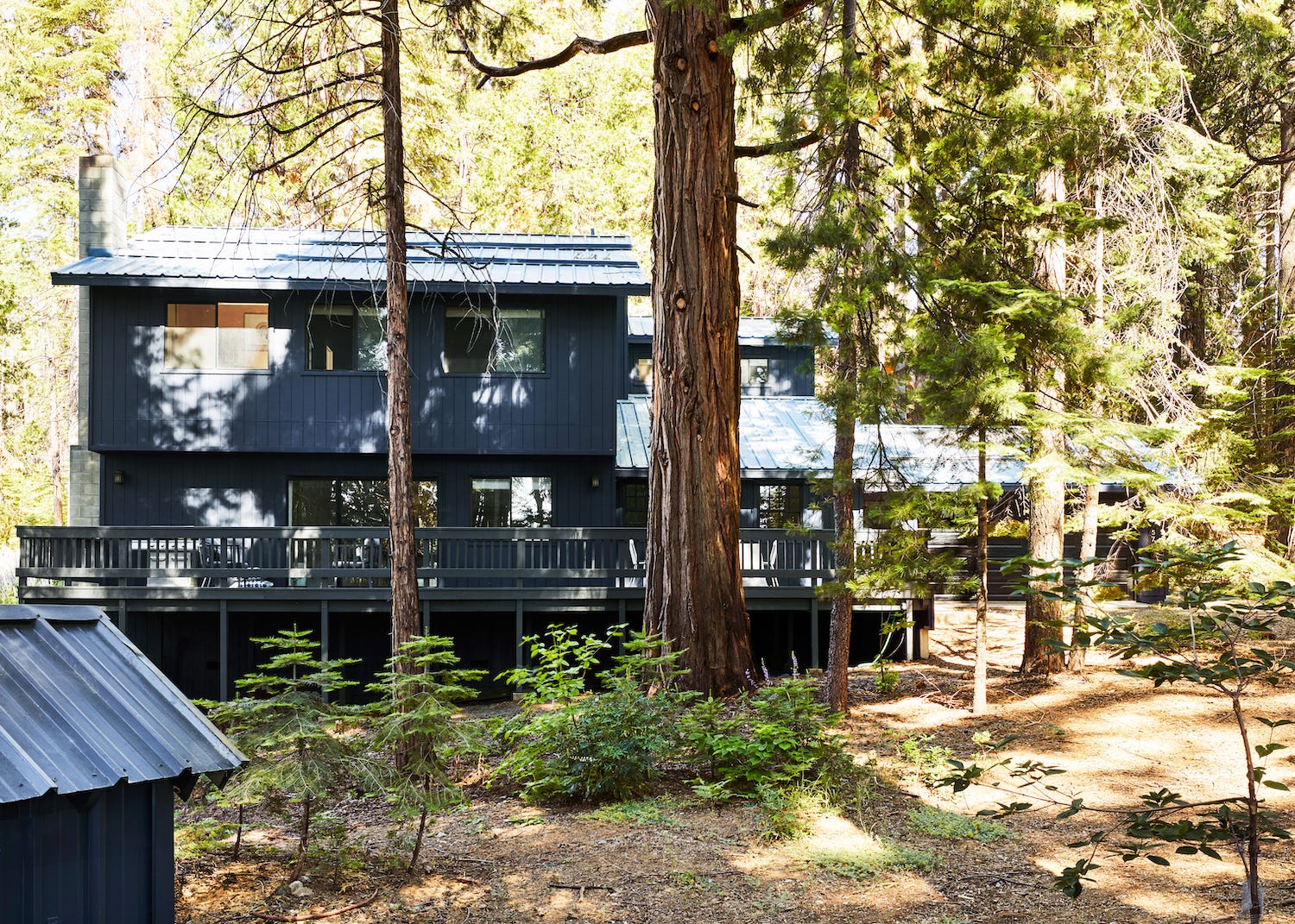
One thing that strikes me when I look at the before images is just how shaded and snarled my house looked before I cut away trees. The first thing I did when I moved in was remove any trees that were touching the house (or too close). And thank god I did that - there was an unprecedented wind storm that winter that ruined more than half the roofs in town. I removed trees mostly for fire safety, but the longer I live in this house the more I want to thin them out. Firstly, trees are a liability in that they drop a TON of branches and debris all the time and really to keep on top of it you have to hire a crew (at $2000 a pop) to clear everything out in the spring and the fall. It’s just a lot to keep up with.
I didn’t move to the forest to cut down all the trees, but I’m trying to thin them out over time so each tree has space to grow and so that it’s safe to move around the property. When trees are too dense, it gets hard to clean between them and it just turns the property into a thicket of downed branches, scraps of wood, and drying plant matter.
I think I started dreaming about having a cabin around 2010. This was when my parents had started talking about leaving Yosemite (you have to move out when you retire there because it’s a national park and the residences are owned by the Park Service). Back then, I really wanted a modern, Scandinavian cabin. Something about the contrast between a home in nature (the past, tradition, history) and a contemporary Scandinavian interior (modern, bright, NOW) felt interesting to me. However, the years that followed have been filled with influencers buying cabins in Upstate New York and rural Southern California. And almost ALL of them have been modern makeovers.
I think there’s a strong conceptual reason for these modern makeovers but as someone who makes content for a living, I’m not all that interested in telling a story that’s been told a few too many times before. I still love a modern cabin, but for me the purpose of this house is nostalgia (for my past here, for nature, for some sort of comfort that probably never really existed in the first place).
The reason I’m bringing up the modern cabin movement is mostly to talk about one element of it that I find kinda played out: the black exterior. I’ve seen old churches upstate* painted black. I’ve seen adorable A-Frames painted black. I’ve seen cute cottages painted black. And they all look GREAT.
*Upstate refers to Upstate New York ONLY. Anyone referring to Northern California as “Upstate” will be promptly asked to LEAVE.
However, painting a kinda MEH house black to make it look fresh and cool has started to feel stale to me. Does it work almost every time? Yes. But is it something I want to promote wholeheartedly, definitely not. Basically, I have a huge problem with people painting houses in hot areas black then just increasing the amount of AC they use. Dark homes do absorb more heat and while there doesn’t seem to be a consensus on exactly how much more AC you’ll need to use in a dark house, it seems like it’s at least 20%-30% in the hotter months, which is literally just energy you’d be wasting to look cool.
I actually did install AC the first summer I was at Londo Lodge, less for actual cooling down than for a system I could keep running with the windows closed when the next fire comes. When I moved in in October 2020, the air was orange for months and it was hard to breathe. I knew after that I wanted AC just so I could close the windows and have a filter going. I actually haven’t used the AC this year as the house stays pretty cool under all that tree cover. But worrying about making my house more inefficient definitely made me wonder if this color was right for my house.
Now that I’ve had Goodnight Moon installed on my home’s exterior more than a year, I can say that I HIGHLY recommend it with one caveat. I don’t think this color (or any dark color) is right for you if live in a hot area where you use AC every day in the summer, unless you have solar (which I’m planning to get eventually). If you live in a colder region like mine, it’s perfect. If I lived in a sunnier, hotter place (and I didn’t have my stupid ugly ass roof to contend with) I would have gone with one of Clare’s more subtle, dreamy colors like Rain Check or Penthouse. I guess my go-to paint tip, “Paint light spaces light colors and dark spaces dark colors,” really works outside too. I think this dramatic color works particularly well in a moody, shady area like the property Londo Lodge sits on.
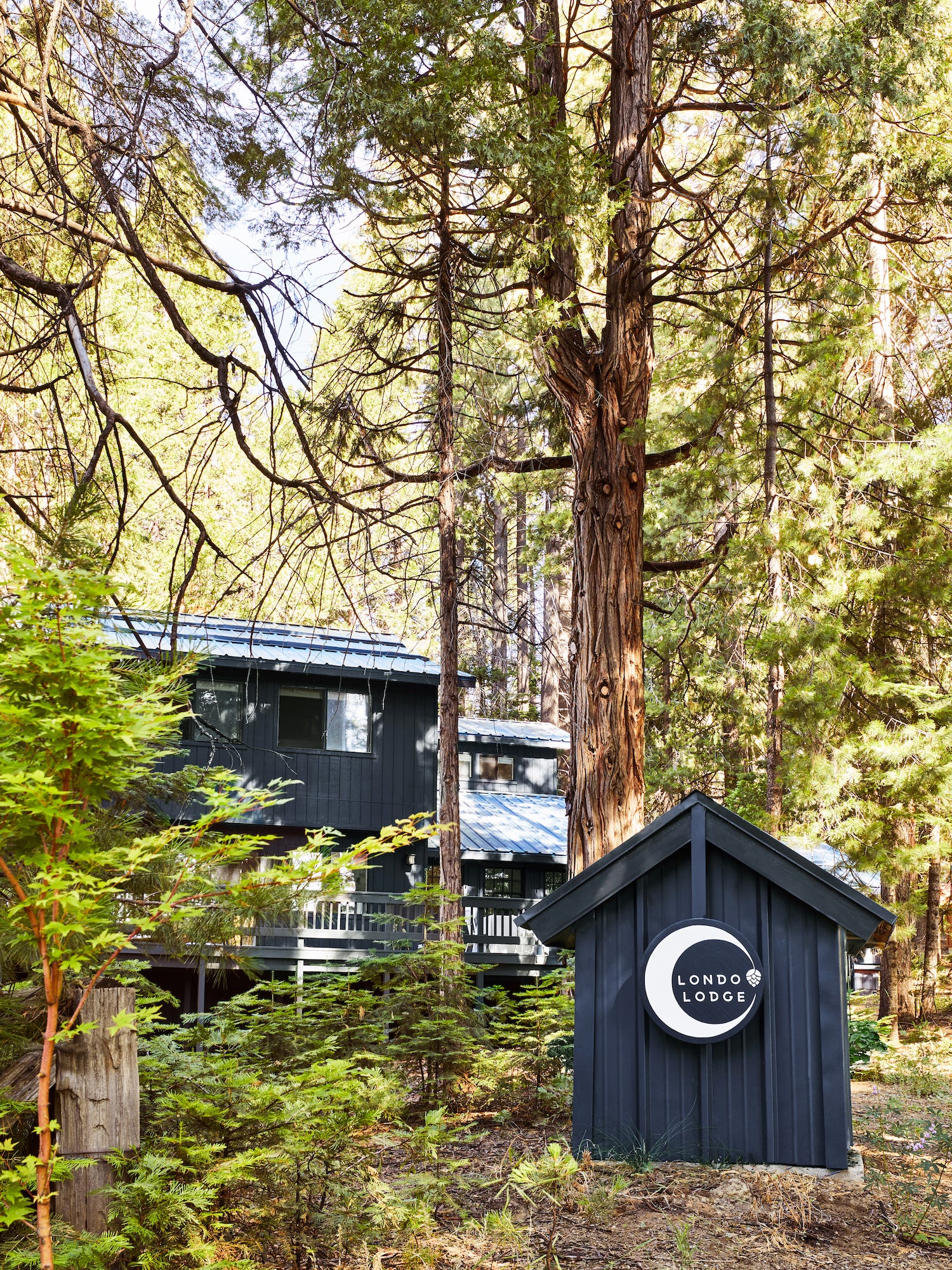
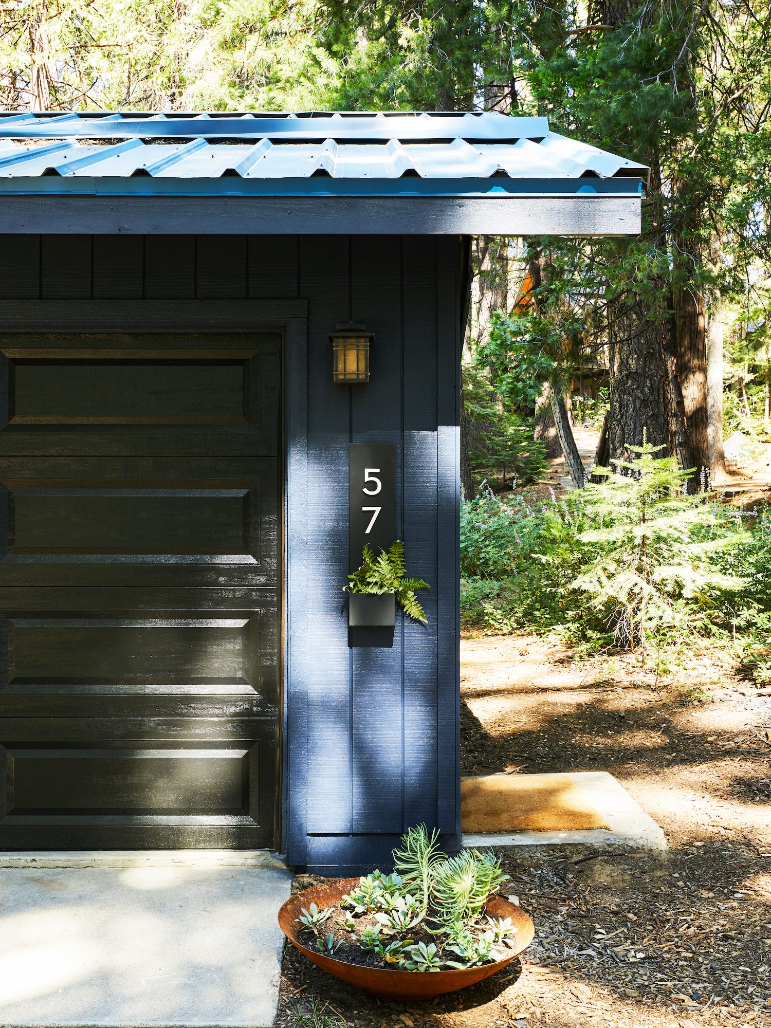
My favorite thing about Goodnight Moon is that it really feels alive. It’s a color that feels so at home in nature because it changes as the day progresses. In bright morning light, it’s indigo. In the flat midtone of midday, it’s denim. At night, it’s a rich, violet black. This chameleon quality makes the color intoxicating and witchy. And it even inspired the Londo Lodge logo, a celestial moon with a pinecone-as-star accent.
Before I’d even closed on the house, I procured a sponsorship with a fireproof shingle company. My plan is to re-clad the outside of the house with fireproof concrete shingles to give the exterior a more traditional Craftsman vibe. Unfortunately, like countless other partnerships during the pandemic, that sponsorship ended up falling through because A) Timeline and B) I didn’t have the funds to pay for labor.
In all honesty, I hate my cheap particleboard siding. It just screams 90s builder home to me. But my main goal with these “good enough for now” renovations is to show people more accessible design solutions. So yes, I’d love to be able to shingle the home’s exterior. But painting the house made SUCH a huge difference. It just feels so much more considered and sophisticated now. And somehow magically made the siding look less awful. AND it somehow made the roof’s color look less annoying and needy by diminishing it.
The eventual goal is to shingle the house once I’ve built an addition I’m planning (in like ten to one hundred years). But luckily the shingles I’m looking at come in a paint-ready finish, just in case I’m not ready to let go of this beautiful, mysterious, witchy color.

First off, I think the roof is kinda cool especially with the new color!!!
Secondly my house (a 1949 cape) is now painted a VERY similar color with orange doors. I was afraid people would think a Witch lived here but luckily no one has tried to burn me at the stake yet….
What a great transformation.. I think you nailed it, and also, who could resist a paint called Goodnight Moon?